A theme is a preset color scheme for the appearance of your app. Changing the theme changes how your app appears to end users when they browse to your site on the web. The theme doesn’t affect the layout and content. Experience Builder provides designer themes with options to customize.
Theme colors
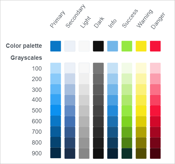
The theme setting determines the colors used in your app. Different themes have different color sets. There are eight color variables in a set: Primary, Secondary, Light, Dark, Info, Success, Warning, and Danger. Each color variable has nine grayscales that consist of the theme colors for your app to apply to pages and widgets. For example, as you configure the widgets, the default color choices match your app theme and your organization’s shared theme (if applicable). In addition, you can customize widget colors by choosing from a set of recommended Standard colors, Recent colors, or More colors to create your own. You can also clear the selected color to use a system default that depends on surrounding colors.
The eight color variables compose the color palette for the theme. The nine grayscales are generated automatically by Experience Builder.

Use theme colors
When you use a theme color to style elements in your app, the element references a theme color variable. When you change the app’s theme, the value of a theme color variable changes, and the element’s color changes accordingly. For example, a button background can use primary-400, which is a median blue in the default theme. If the theme is changed to vivid (in which primary-400 is a median orange), the button background changes to median orange.
By default, the color variables are mapped for use in the following app elements:
- Primary colors are used for the active state of the interactive UI elements, such as buttons and menus.
- Secondary colors are not used by default. This color variable is provided for additional variety. For example, you can customize it to match your brand. When you build your app, configure an element (such as a widget’s active state) to use the custom color.
- Light colors are used mostly for the background color of the containers and their outlines.
- Dark colors are used mostly for text.
- Other colors in the palette are not used in app UI elements by default, but they are used in system-generated alert messages, such as when functional widgets perform correctly or not. You can also use these alert colors for the UI. For example, you could add a button with an urgent action using a danger color or choose a warning yellow for the app header. Keep in mind, however, that if you change these colors in the theme settings, the associated elements and system message colors change accordingly.
- Info colors—Used for information messages.
- Success colors—Used for success status messages, such as when a widget process succeeds and generates a message.
- Warning colors—Used for warning messages.
- Danger colors—Used for error or danger messages, such as when a widget process fails.
Settings
In the Theme panel, you can select one of the following predesigned themes to apply to your app:
- Default—Mainly blue and white.
- Dark—Dark background with highlights.
- Vivid—Bright tones.
- Organization Shared—Sync with the shared theme setting in your organization. You cannot customize colors when you choose this setting. If you don't choose this theme, you can still choose colors from the shared theme when you configure color settings for a widget.
Click Customize to change a color palette. When customizing a color palette, you can select from the set of recommend color palettes or customize the color for any of the theme color variables.